Imagery
The article illustration system builds on the strategic direction established in Visual Identity Direction — specifically the “Imagery and Illustration Style” section, which calls for abstract-organic illustration that represents the acoustic experience as a journey rather than a problem. This page translates that direction into concrete execution specs for article hero images: a repeatable style, a topic-coded color system tied to the five content pillars, and a modular OpenAI gpt-image-1.5 prompt template that produces consistent results at scale.
The system covers approximately 178 articles across English and German, each needing a hero illustration that communicates its content pillar at a glance while remaining unmistakably part of the Naluma visual family.
Illustration Style
Section titled “Illustration Style”The style is textured flat — bold, simplified shapes with visible risograph grain texture on all filled surfaces. No outlines. Shapes define form through confident fills and overlapping semi-transparent layers that interact to create depth. The effect is screen-print editorial illustration: warm and crafted, with enough structure to maintain the Authoritative position on the Brand Personality Spectrum while the grain texture and organic overlap carry the warmth that the 70% Warm position demands.
Saturation runs high within the constrained palette — opacities between 0.6 and 0.85 keep topic colors punchy and present rather than washed out. This is deliberate: at article card thumbnail size, the pillar colors must remain recognizable and distinct. Low saturation would collapse the color coding system at small sizes.
Subject matter is literal but stylized. A sleep article shows a bedroom. A sound therapy article shows headphones. Users connect topic to image without interpretation, which serves the 80% Specific position — imagery that was chosen because it represents something true, not because it fills a slot. Recognizable objects are rendered as simplified forms within rounded geometric containers: circles, pills, rounded rectangles. Clean, reproducible, consistent across the library.
The avoidances from Visual Identity Direction apply with full force: no threatening waveforms, no ear or hearing aid as primary subject (acceptable as secondary element), no geometric patterns without acoustic or light reference, no stock wellness photography aesthetics, no detailed human faces, no text within illustrations.
Topic-Coded Color System
Section titled “Topic-Coded Color System”Every illustration uses a shared base palette plus a pillar-specific color pair. The base palette anchors every image in the Naluma warm-earth family; the pillar pair provides instant visual differentiation when article cards sit side by side.
Base Palette
Section titled “Base Palette”These three colors appear in every illustration regardless of content pillar. They are the visual constants that bind the system together.
| Role | Color | Hex |
|---|---|---|
| Background | Warm White | #FBFAF1 |
| Accent fill | Warm Gold | #F2C087 |
| Strong accent | Burnt Sienna | #D17456 |
The background maps to the existing primitive.color.warm-white / --semantic-color-surface-primary token. Warm Gold and Burnt Sienna are drawn from the core Naluma palette, ensuring that even if pillar colors were stripped away, the illustration would still read as on-brand.
Pillar Color Pairs
Section titled “Pillar Color Pairs”Each content pillar is assigned a primary and secondary color. The primary carries the dominant fill (~40% of the composition); the secondary supports it at roughly 25%. The remaining area is allocated to Warm Gold (~15%) and Burnt Sienna (~10%), with the Warm White background providing negative space.
| Pillar | Primary | Hex | Secondary | Hex |
|---|---|---|---|---|
| P1: Understanding Tinnitus | Warm Amber | #C4935A | Golden Honey | #E8B870 |
| P2: Living With Tinnitus | Dusk Indigo | #5C6B8A | Soft Steel | #8A9DBF |
| P3: Evidence-Based Treatment | Sage Green | #7A9E7A | Soft Mint | #A8C4A8 |
| P4: Myths & Unproven Remedies | Warm Terra | #B87A5A | Soft Clay | #D4A07A |
| P5: Recovery & Habituation | Soft Purple | #A87BA5 | Lavender Mist | #C4A0C2 |
The color rationale is intentional. P1 (Understanding) uses warm amber and golden honey — knowledge as illumination, warm light. P2 (Living With It) introduces dusk indigo and soft steel — the emotional depth of daily rhythms, sleep, nighttime. P3 (Treatment) uses sage green and soft mint — growth, healing, therapeutic progress. P4 (Myths) stays deliberately within the warm family with terra and clay — debunking content should feel grounded and trustworthy, not clinical or alarming. P5 (Recovery) uses soft purple and lavender mist — dawn, transcendence, a new horizon.


Library-Only Palette
Section titled “Library-Only Palette”The Naluma app’s Library hub introduces one category — Focus — that does not map to any of the five WordPress content pillars. It uses a cool palette distinct from Sage Green (treatment) and Dusk Indigo (sleep), reading as clear, alert, present-moment attention.
| Surface | Primary | Hex | Secondary | Hex |
|---|---|---|---|---|
| App Library: Focus | Clear Teal | #5A9E9E | Pale Aqua | #A8D4D4 |
OpenAI gpt-image-1.5 Prompt Template
Section titled “OpenAI gpt-image-1.5 Prompt Template”The pipeline previously targeted DALL-E 3; it now targets OpenAI’s gpt-image-1.5. The prompt is modular: four sections that are assembled per article or category, with only {pillar_primary}, {pillar_secondary}, and {scene_description} varying between illustrations.
[STYLE] Textured flat illustration in the style of a risograph screen-print:visible paper grain, subtle ink misregistration, layered organic shapes thatoverlap with slight transparency. Editorial, warm, crafted; calm andcontemplative. No people, no faces, no human silhouettes, no text, no logos,no UI elements, no medical or clinical imagery, no instruments, no candles,no yoga or meditation imagery.
[PALETTE] Warm white #FBFAF1 background; warm gold #F2C087 and burnt sienna#D17456 as small accents; primary {pillar_primary_name} {pillar_primary_hex}about 40% of the composition; secondary {pillar_secondary_name}{pillar_secondary_hex} about 25%.
[SCENE] {scene_description}
[COMPOSITION] Wide horizontal scene with the central subject placed withinthe middle horizontal third of the frame; quiet negative space above andbelow (image will be cropped to a 16:6 banner for app Library cards or to16:9 for WordPress article cards).
The STYLE block is fixed. The expanded “no” list comes from production failure modes: yoga silhouettes and candles read as wellness clichés, medical imagery (stethoscopes, ear anatomy) creates anxiety, human faces drift into uncanny territory at simplified-shape resolutions.
The PALETTE block substitutes the pillar’s name/hex pairs. The “about 40% / about 25%” wording is intentional — gpt-image-1.5 honours hue-family proportions reliably, hex precision less so.
The SCENE block is a 30–50 word literal scene description of concrete physical objects in spatial relationships (foreground / beside / above), built around a metaphor for the article’s theme rather than a literal depiction. See “Scene description rules” below.
The COMPOSITION block is what makes the same prompt usable for both surfaces: the central subject lives in the middle horizontal third of a 1536×1024 generation, so cropping to the app’s 16:6 banner or to WordPress’s 16:9 card both keep the focal subject intact.
Scene description rules
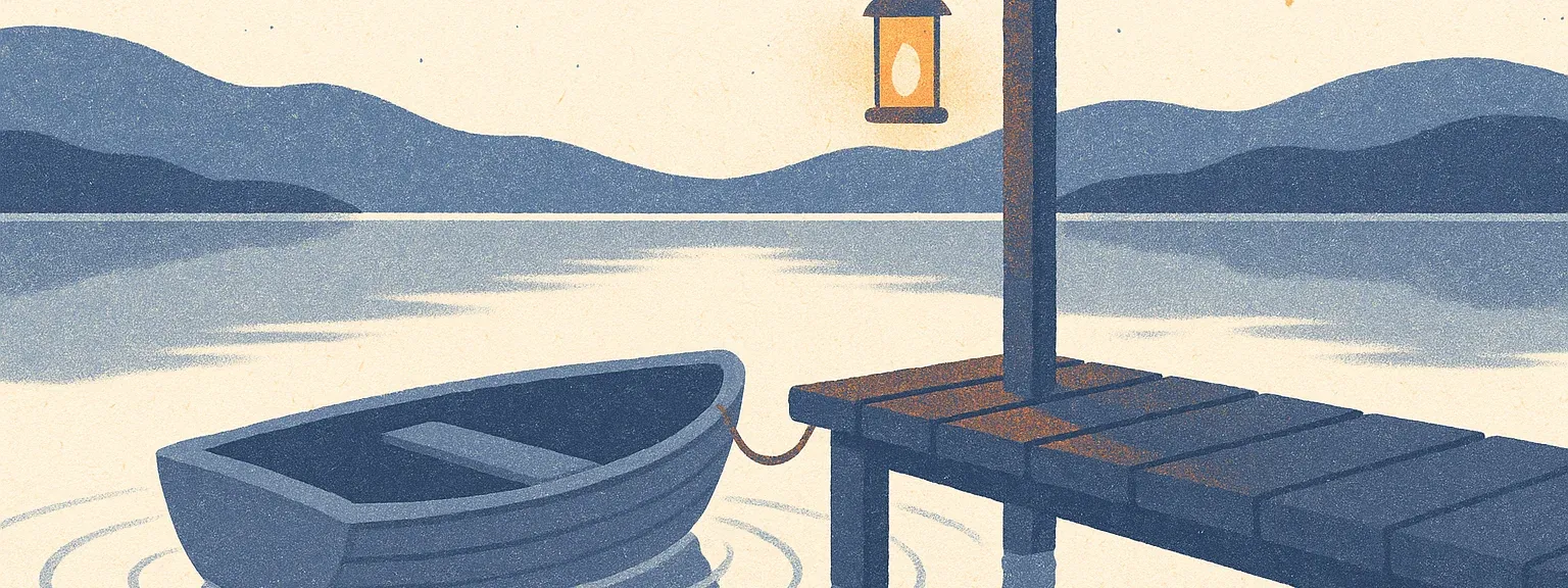
Section titled “Scene description rules”A vague scene (“a calming sleep environment”) produces generic stock-art results. A literal-but-metaphorical scene (“a small empty rowboat tied at a wooden dock on a still lake; a lit lantern hangs from the dock post; concentric ripples spread outward across glassy water”) produces distinctive editorial illustration that reinforces the article’s theme without showing medical content.
Rules a scene description must follow:
- Concrete physical objects only. “A folded blanket,” “a glass jar,” “a brass key” — not “calming vibes,” “a sense of peace,” or any abstraction described as a visual.
- 2–3 distinct elements per scene with concrete spatial language (foreground, behind, beside, overlapping).
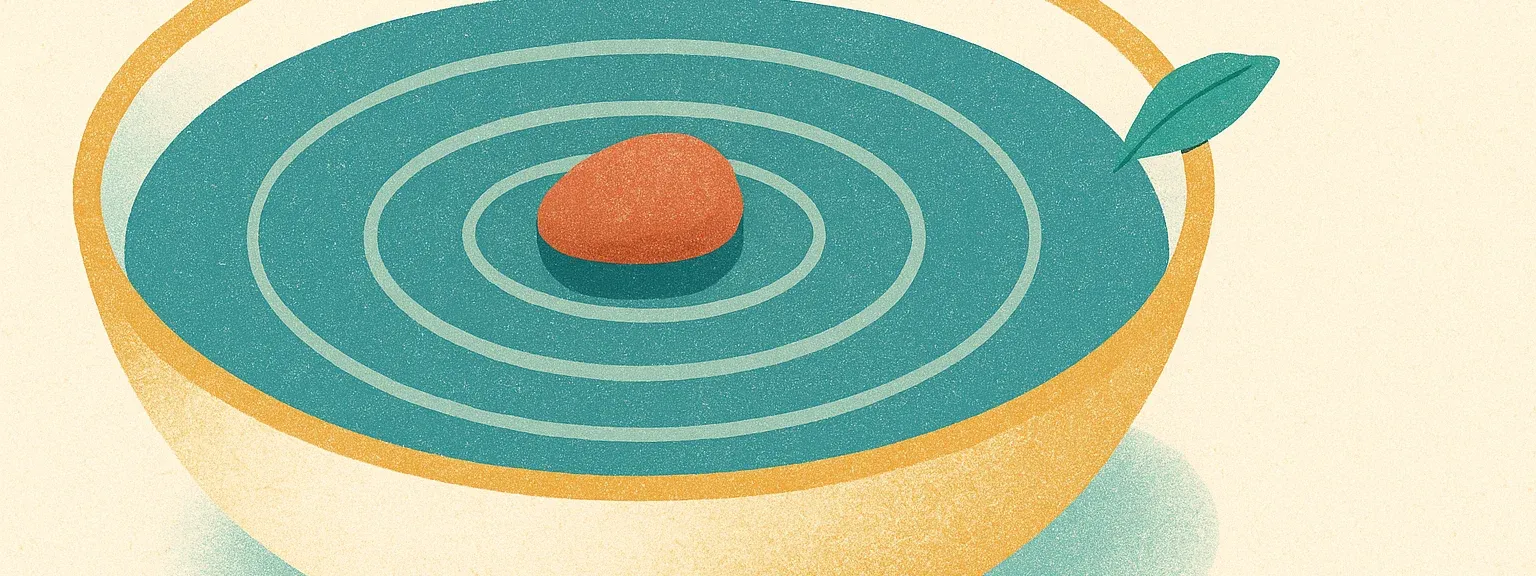
- Metaphor, never literal medical imagery. A sleep scene shows a rowboat at dusk, not an ear or a sleeping figure. A focus scene shows a single pebble in still water, not a brain or sound waves.
- No colour or style directives in the scene text — those live in the STYLE and PALETTE blocks. Mixing them in the scene introduces conflicts.
- No stock wellness clichés — yoga silhouettes, candles, lotus-position figures, generic spa scenes. They are undistinctive and readers ignore them.
- 30–50 words. Longer scenes dilute the focal subject; shorter scenes leave gpt-image-1.5 too much creative latitude.
Assembled example (Library: Sleep)
Section titled “Assembled example (Library: Sleep)”Textured flat illustration in the style of a risograph screen-print: visiblepaper grain, subtle ink misregistration, layered organic shapes that overlapwith slight transparency. Editorial, warm, crafted; calm and contemplative.No people, no faces, no human silhouettes, no text, no logos, no UI elements,no medical or clinical imagery, no instruments, no candles, no yoga ormeditation imagery.
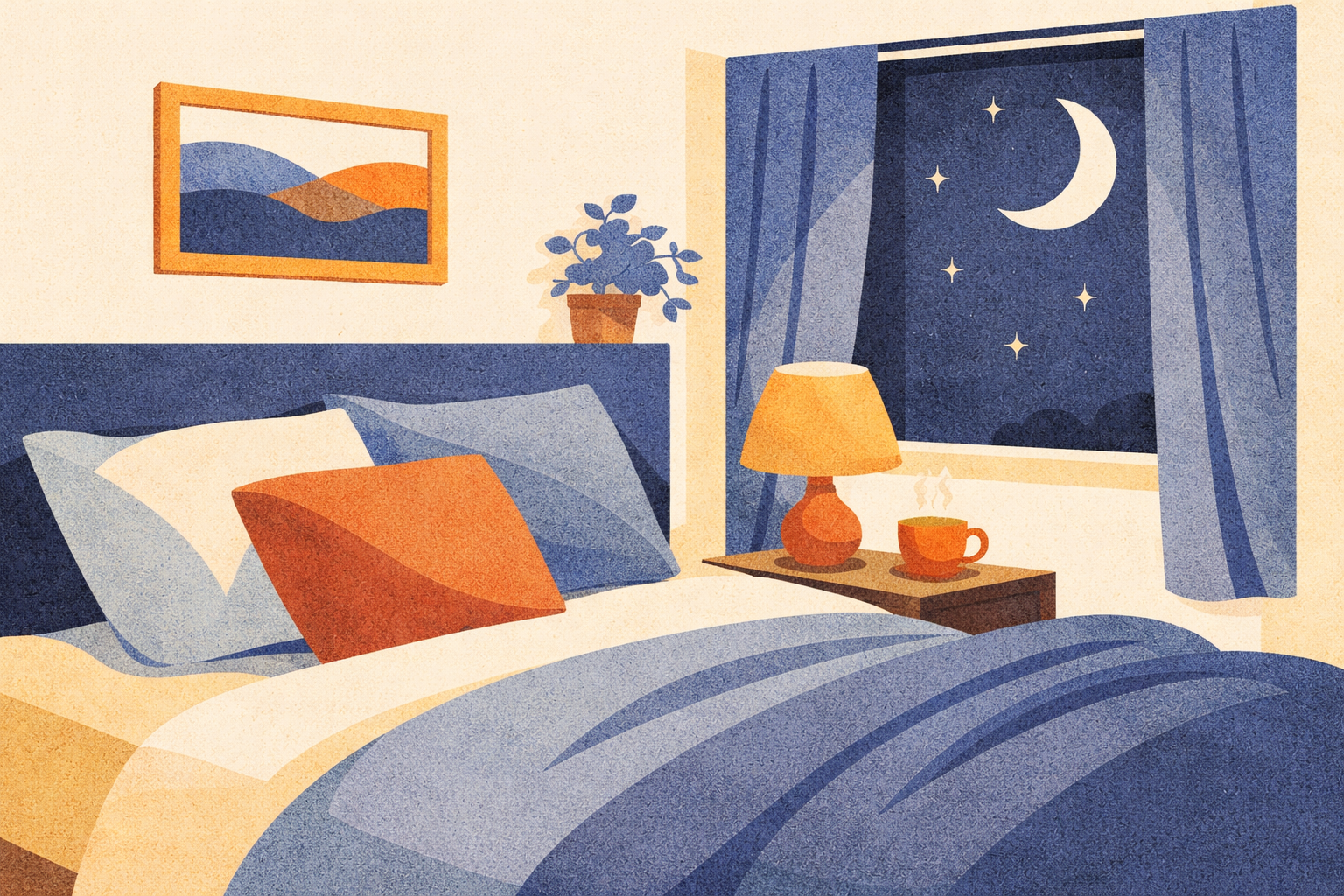
Warm white #FBFAF1 background; warm gold #F2C087 and burnt sienna #D17456 assmall accents; primary dusk indigo #5C6B8A about 40% of the composition;secondary soft steel blue #8A9DBF about 25%.
A small empty rowboat tied at a wooden dock on a still lake. A lit lanternhangs from the dock post. Distant low hills meet a star-flecked horizon.Concentric ripples spread outward from the boat across glassy water.
Wide horizontal scene with the central subject placed within the middlehorizontal third of the frame; quiet negative space above and below (imagewill be cropped to a 16:6 banner for app Library cards or to 16:9 forWordPress article cards).Color fallback strategy
Section titled “Color fallback strategy”gpt-image-1.5’s hex compliance is more reliable than DALL-E 3’s, but still imperfect. If generated images diverge from the target palette, try descriptive HSL phrasing instead of hex codes — “muted dusk indigo, slightly cool” rather than #5C6B8A. The acceptance threshold is hue-family accuracy, not hex-level precision: pillar colours must be recognisable and distinct from each other when category cards sit side by side.
App Library Category Imagery
Section titled “App Library Category Imagery”The Naluma app’s Library hub renders six category cards, each with a wide horizontal banner illustration. The mapping between app category and pillar palette is:
| App category | Palette | Primary | Secondary |
|---|---|---|---|
| Understanding | P1 Warm Amber | #C4935A | #E8B870 |
| Thoughts | P5 Soft Purple | #A87BA5 | #C4A0C2 |
| Sleep | P2 Dusk Indigo | #5C6B8A | #8A9DBF |
| Relaxation | P3 Sage Green | #7A9E7A | #A8C4A8 |
| Focus | Clear Teal (library-only) | #5A9E9E | #A8D4D4 |
| Social | P4 Warm Terra | #B87A5A | #D4A07A |
P4 (Warm Terra) is reused here for Social rather than its WordPress “myths and unproven remedies” framing — the earthy terra/clay tones read as warm human conversation in a category context. Focus is the only category without a WordPress-pillar parent and uses the new Clear Teal palette documented above.
The illustrations follow the same prompt template as the WordPress hero illustrations, with two adaptations:
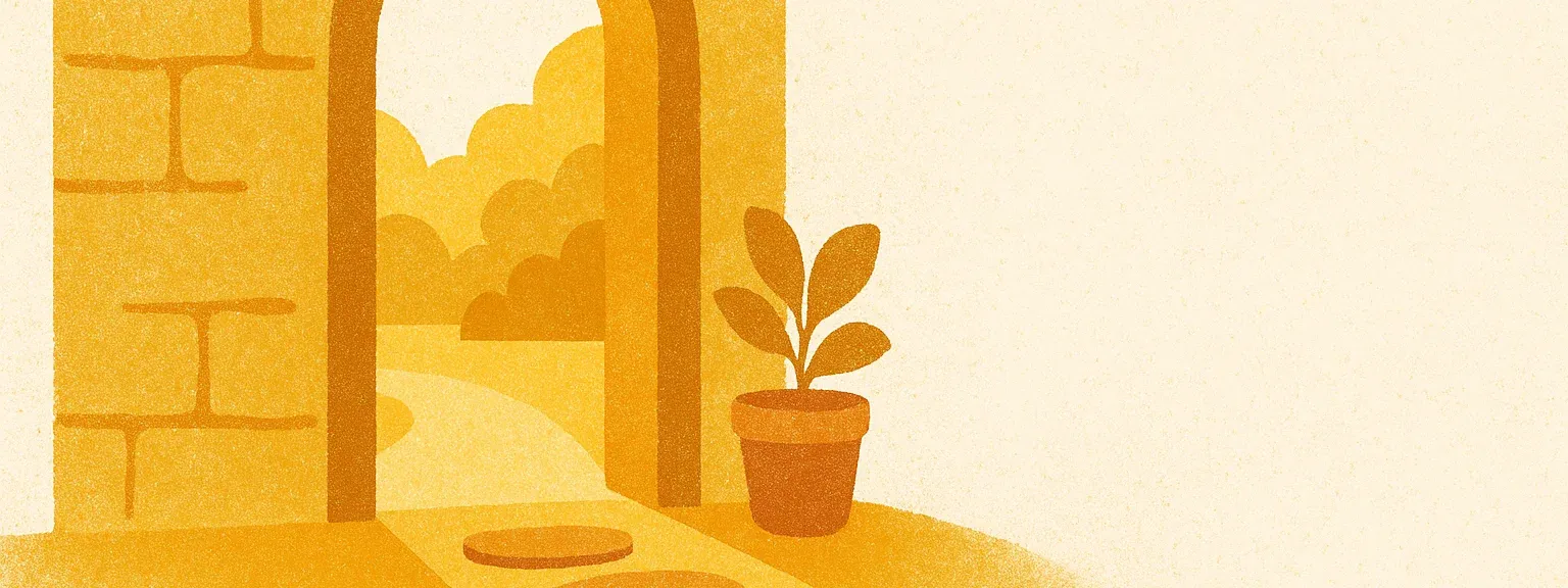
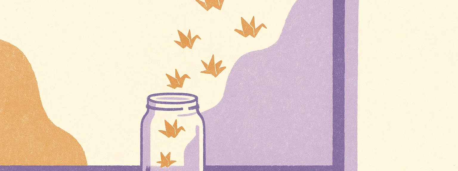
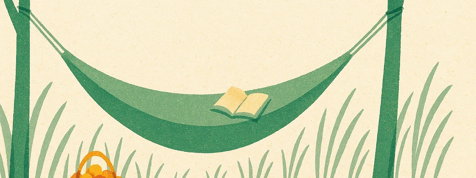
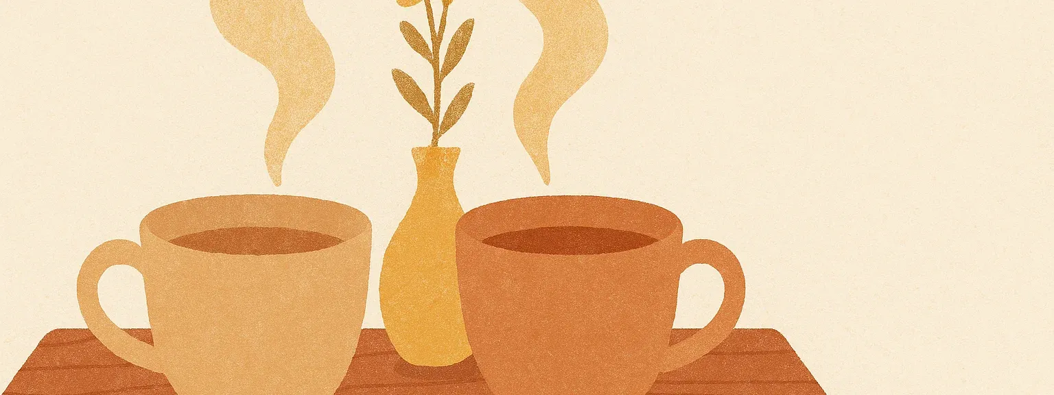
- The SCENE is metaphor-first (see scene rules above) — the six chosen scenes are: a rowboat-and-dock at dusk (Sleep), a paper jar releasing origami cranes (Thoughts), a single pebble in a still bowl of water (Focus), two ceramic teacups touching (Social), an open doorway with light spilling onto a stone path (Understanding), a hammock between two trees (Relaxation).
- The COMPOSITION reserves the middle horizontal third for the focal subject so 16:6 cropping at runtime keeps the subject intact.
Creating New Illustrations
Section titled “Creating New Illustrations”The workflow for producing a new article illustration follows five steps.
First, identify the article’s content pillar. Every article in the content architecture maps to exactly one of the five pillars — this determines the color pair.
Second, write a literal scene description. Name specific objects, the setting, and the mood. Think in visual nouns: what would a viewer see? A bedroom, a magnifying glass, a winding path. Avoid abstract concepts that gpt-image-1.5 cannot render directly.
Third, assemble the full prompt by inserting the pillar’s color pair (with hex values) and the scene description into the template. The STYLE, COMPOSITION, and AVOID blocks remain unchanged.
Fourth, generate the image at 1536×1024 (gpt-image-1.5 high-quality output). Generate two or three variants and select the strongest. The COMPOSITION block of the prompt keeps the focal subject in the centre horizontal third, so a single source can be cropped to either 16:6 (app Library banner) or 16:9 (WordPress article card) without losing the subject.
Fifth, evaluate the result against five criteria:
- Style consistency — does it feel like it belongs to the same system as existing illustrations?
- Color accuracy — are the pillar colors recognizable? Is the hue family correct?
- Grain texture — is the risograph quality present and consistent across filled surfaces?
- Subject clarity — can you identify the article topic at a glance, including at thumbnail size?
- Brand fit — does it feel warm, calm, and unmistakably Naluma?
If the image fails on any criterion, adjust the scene description or apply the color fallback strategy and regenerate. Most articles require one to two iterations.
Technical Specs
Section titled “Technical Specs”Generated illustrations are 1536×1024 from OpenAI gpt-image-1.5 (high quality). For app Library banners they are centre-cropped to 16:6 (1536×576) and exported as WebP at quality 85, targeting under 400KB per image. For WordPress article cards they are downscaled to 896×512 and exported as WebP at quality 85, targeting under 100KB per image. Both surfaces share the same source generation — the COMPOSITION block of the prompt keeps the focal subject in the centre horizontal third so either crop preserves the subject.
File naming follows the pattern {pillar}-{slug}.webp for WordPress articles (e.g. p2-tinnitus-sleep.webp) and {category}.webp for app Library banners (e.g. sleep.webp). The same illustration is reused for both English and German versions of an article. Illustrations are language-neutral by design: no text appears within them, and the visual subjects (a rowboat, a doorway, a pebble in water) carry meaning without language.
In WordPress, illustrations are uploaded as featured images through the media library and displayed in the article card’s hero slot, which applies an 8px top border-radius and content-aware cropping. In the Naluma app, illustrations are bundled under assets/images/library/ and rendered by NCategoryCard with BoxFit.cover at a 16:6 aspect ratio.
For dark mode, test every illustration in both contexts where it appears: on the card surface (#352C29) and against the page background (#2A2220). The warm cream background of the illustrations creates a deliberate contrast against the dark UI — this is intentional and should not be “fixed” by darkening the illustrations themselves. The warmth of #FBFAF1 against #2A2220 mirrors the dusk-arrival mood described in Visual Identity Direction.